What’s more brutal than a trip to Walmart? Hordes of zombies, Black Friday murders and worst of all… mobility scooters. I’m part of Community of Metal Designers, a metal design Facebook group featuring some of the sickest designers in the game. We recently held a fun contest to redesign the Walmart logo and the results were fantastic.
Walmart themselves even gave a little love to Nephilim Art which is a phenomenal win. My entry features a cyberpunk/tech death style version of the Walmart logo. Check it out:
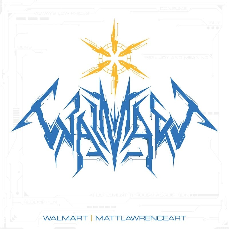
This was my first shot at a tech death style logo, so I went full Decepticon and made tons of aggressive sharp angles and circuitry. Symmetrical design is a big part of metal logos, so I shot for symmetry here. Creating the look was tough and required a lot of different sketches to finally nail down the basic shape of the logo. Here’s the sketch I settled on, with some progression to the final logo shape:
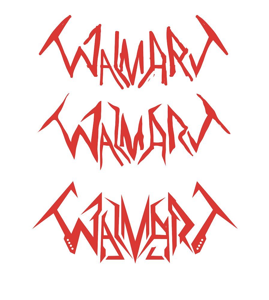
Some of my friends inquired about technique. My thought process is essentially:
- Draw half of the logo
- Copy/group that half
- Flip it then draw/erase over the top to see how I could preserve the symmetrical elements
- Achieve a basic shape
- Refine details while zooming in/out frequently to make sure I’m on track
While most metal artists tend to prefer Photoshop or other raster programs for their logo work, I’m an Illustrator user and prefer vector. This logo was done strictly in Illustrator. I used a few circles/rectangles here and there (especially with the circuitry), but 95% of the logo utilized the pen tool as it’s the easiest to make straight lines/shapes.
Some key design factors that I kept in mind:
- Consistency – I used the same stroke width and circle shapes throughout the logo.
- Slight imbalances – I kept visual interest with overall symmetry but slight imbalances in shapes and details to keep the viewer engaged.
- Illegibility – I wanted this logo to be largely indecipherable, so I added a lot of sharp projections to reduce readability.
- On-brand – I utilized the actual Walmart brand guidelines to pick the colors, maintaining a strong connection to the original while creating a full-blown redesign.
- Symbol shape – I also kept the basic shape/feel of the symbol to reference the original logo.
Need a logo for your business, band or any other project? Send me a message and let’s get to work!
Read my funny Walmart article – Should You Wear Pants In Walmart? A Simple Guide To Covering Your Fat Ass With Clothing
