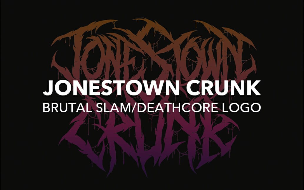
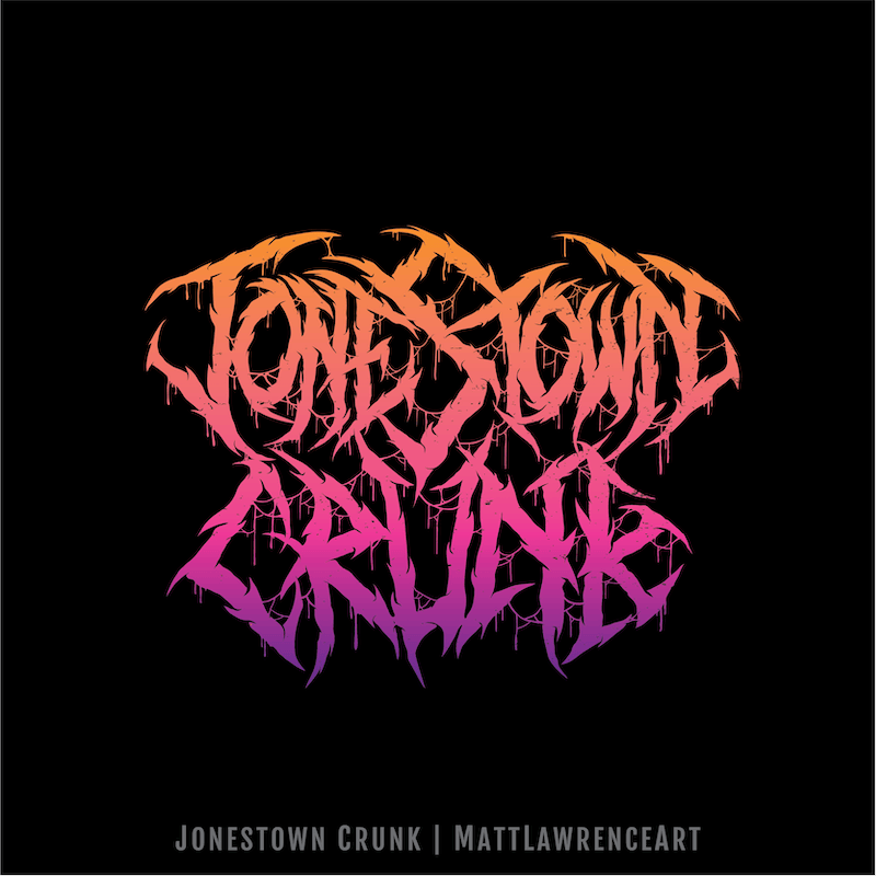
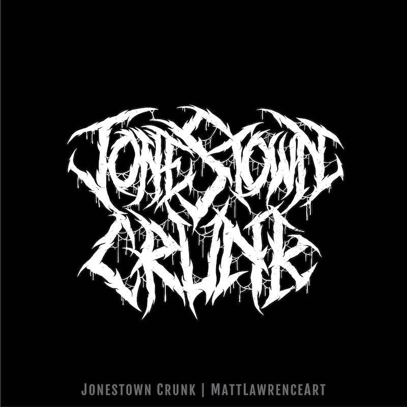
What’s more brutal than getting crunk on Jonestown kool aid? This brutal fucking band logo I drew for slam/deathcore (maybe) band Jonestown Crunk. I did two different versions – black and white plus some color. I got a lot of creative freedom with this one, so I put in some 80s colors. Here’s the original sketch:
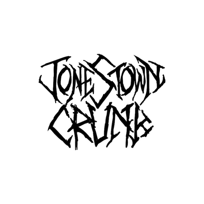
As you can see I’m lazy with sketching and/or my sketch skills are trash. But hey, it gets better I promise!
I went for a bit of rough but imperfect symmetry, which worked out nicely as both words have an odd-numbered amount of letters. I used the S and U to form a central point, mirroring the outside letters as best as I could. I threw in a ton of drips and webbing to make the logo more cohesive and interesting. Here’s the final version:
Want your own brutal (or regular not brutal) logo? Drink the kool aid, then hire me to make you something cool
Check out more of my art here, then read about these awesome metal fast food logos I made
