Sketch Phase
When I make custom logotypes, I give my clients 3-5 sketches to choose from. Unfortunately I didn’t save my initial three sketches, but I did save the one that the client chose. I started off by using Photoshop’s mirror ability and the brush tool to achieve some symmetry. I like to draw the most difficult letters first, then turn off symmetry and sketch around a bit until I find a look that I like that more or less preserves a symmetrical look. Here’s the initial sketch.
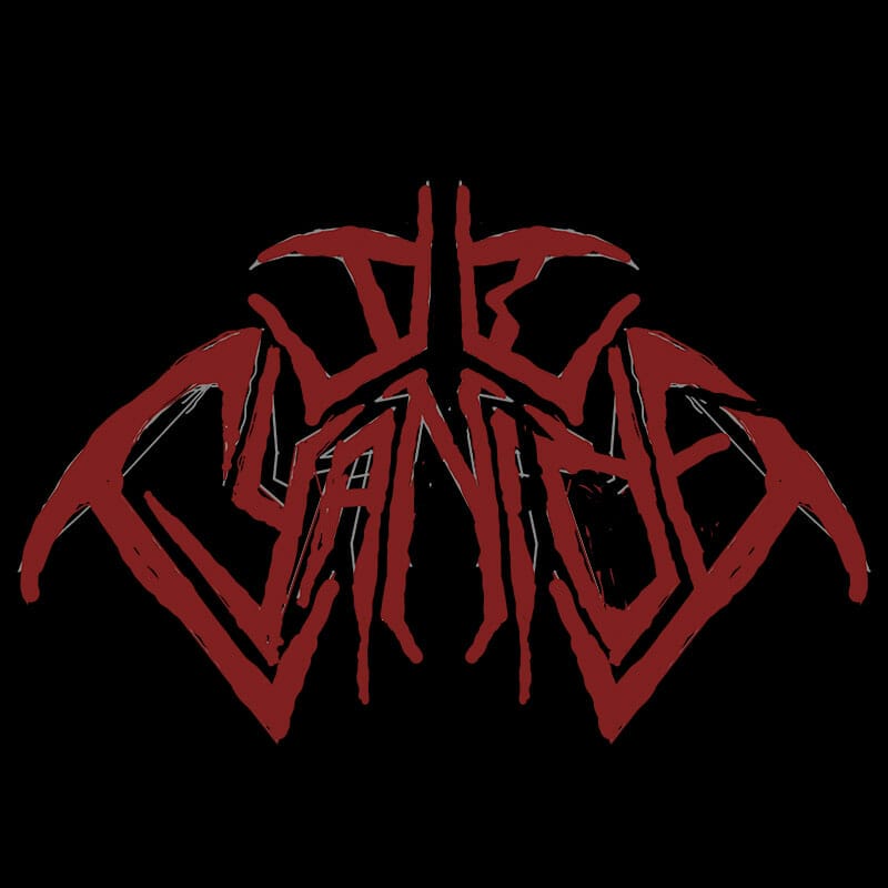
As you can see I started off with some other sketch, then drew over the top of it. Usually I do this in multiple layers in Photoshop so I can refer back to previous versions. This time I screwed up and just started drawing on top. I’ll usually refine a sketch 5-10 times before I start building the actual logo. Once I got the basic look, I refined further, basically starting over and lining things up a bit better. Here’s sketch #2:
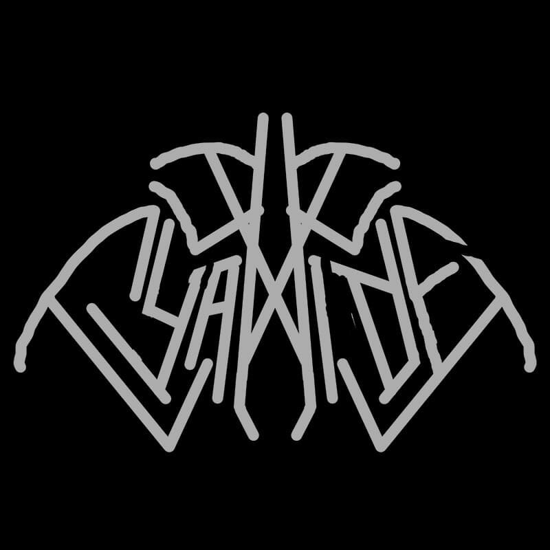
While this looks like a step backwards, you can see the lines are aligned better than before. At this point I sketched over the top and filled the shapes in better, further refining the look. Here’s the next sketch:
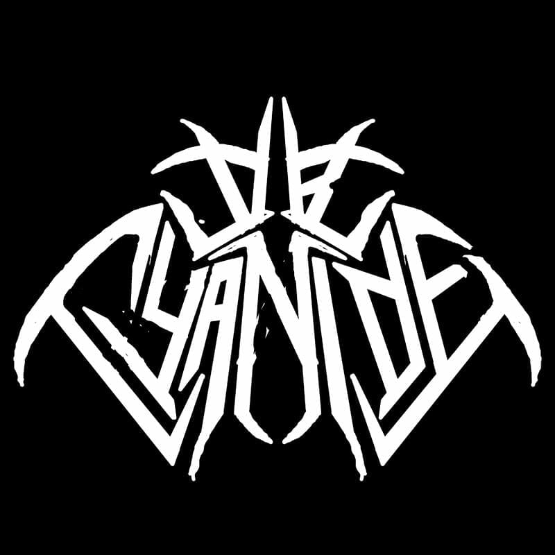
This looks quite a bit better versus the original sketch. I added a couple more sketch versions, but they were minor and not worth showing.
While this is still pretty rough, it’s good enough to move out of Photoshop and into Illustrator. Many of my designer friends who make heavy metal logos like to stick with Photoshop through the entire process. While that method has some great advantages, I’m a hardliner when it comes to making logos in vector format.
Beginning Vector Stages
Cyber/tech logos are mostly straight lines, so Adobe Illustrator lends itself quite well to their creation. I started tracing over my sketch in Illustrator, coming up with a rough basic shape. Here’s the first version of the logo:
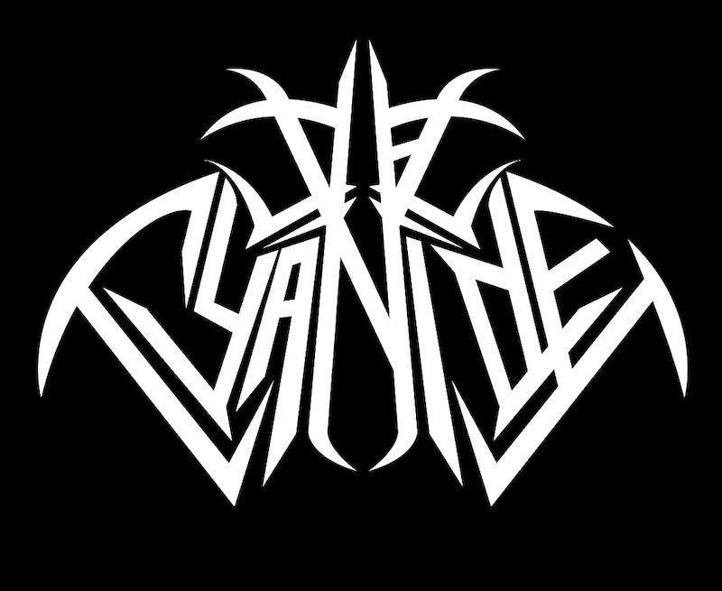
I make these nice, crisp lines using the pen tool in Illustrator, which is one of the most useful tools in the program. At this point I did further refining and altered some of the shapes I wasn’t happy with. With some minor evolution and playing around, I was happy with the final shape and started in on some detail work.
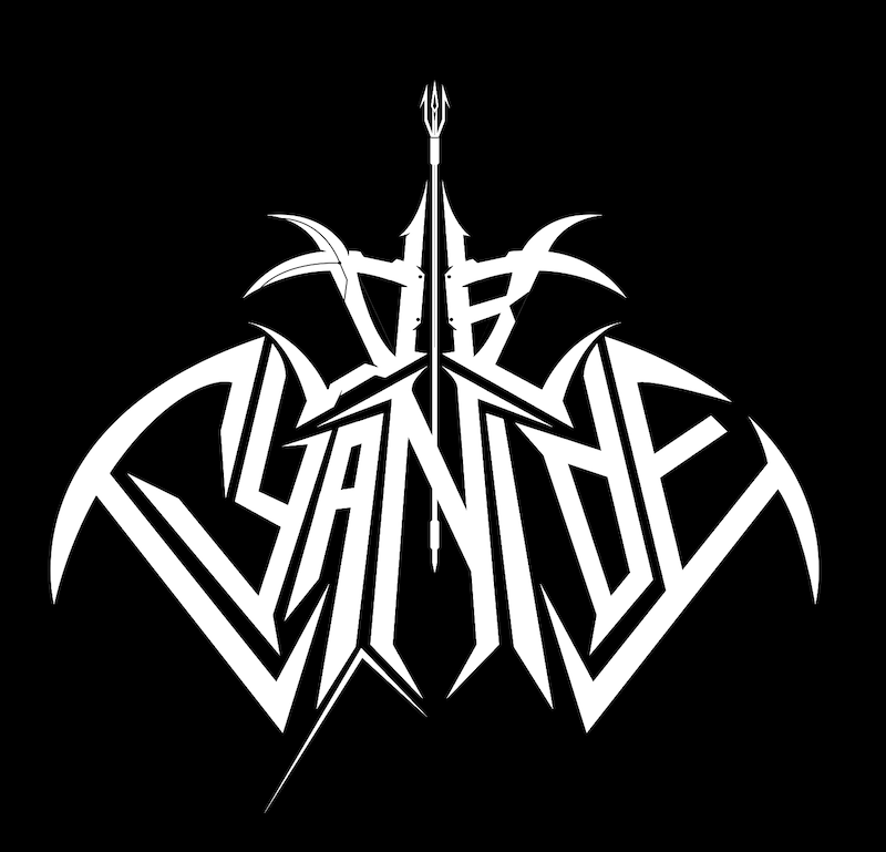
Ultimately I wound up ditching the trident as I felt like I’d been overusing the spear element lately. Refining cyber/tech logos is all about the details, so they come and go quite a bit as I experiment with the best look I can come up with. Here’s a detail shot of significant progress with adding various elements to the logo:
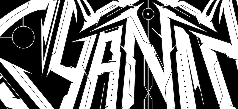
Detailing is quite difficult, as it’s essential that details interact well with each other. I have a sort of “toolbox” of elements that I use with cyber/tech logo design, so I try not to overuse any of these particular elements. I also strike a balance between “visually interesting” and “visual overkill”. It’s quite easy to overdo it and make the logo look too busy, or “underdo” it and leave it too empty. Take a look at the final:
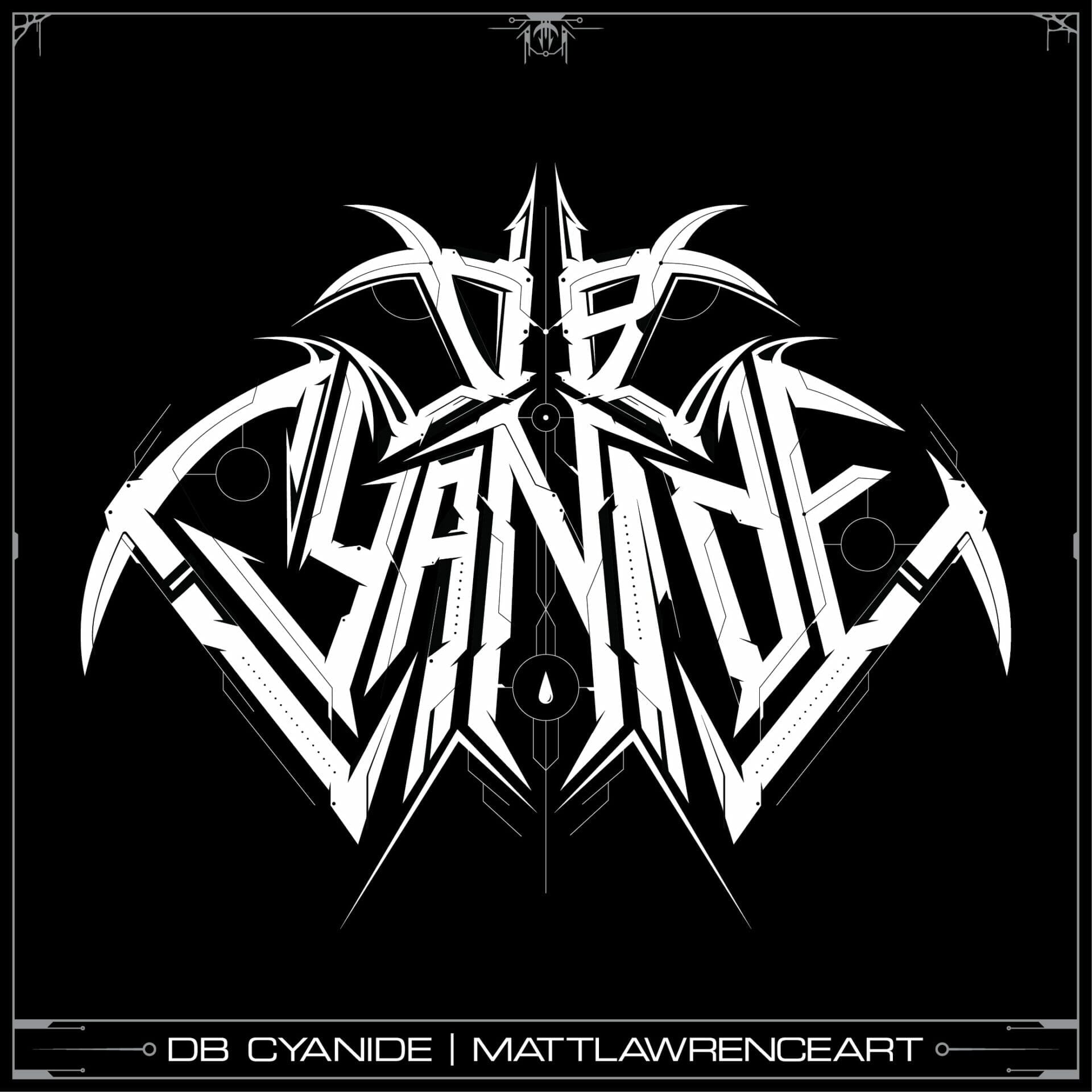
This project turned out fantastic and I loved seeing my cyber/tech logo aesthetic applied to drum & bass. I’d love to work with more DJs and other musicians outside of the metal genre, so give me a shout and let’s get started on your next logo!
Follow me on Facebook, Twitter and Instagram for more of my art
Read next: Walmart Tech Death Logo Redesign
